
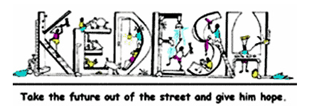
- Next look how our logo is done: uneven, the ‘boys’ in the logo are making a mess. They’re boys: crazy, noisy messy and disorderly, but in a good way. Not an office of professionalism.
- The ‘K’ is a brick wall with the water left on or leaking. Ladder is at the wrong angle nailing nails just for the heck of it with a hammer that is too big. But the kid is having fun and building something.
- The ‘E’ is a boy lounging around scratching a pig or a fat dog, just chilling, I guess that’s a rabbit trying to get a drink and a chicken chasing a goat.
- ‘D’ is one kid being a ladder for another who’s getting shocked by a light bulb.
- ‘E’ is a kid ‘fixing’ a shower but actually breaking it.
- ‘S’ is a kid painting and being messy dumping on another trying to study.
- ‘H’ is a kid baking who knows what, but he’s proud of it, and of course the water has been left on.That’s Kedesh, boys being boys, being trained to do stuff, but in the meantime it’s a mess.
by John Wickes